The Brand Anthropologist supports therapists, coaches, creatives, holistic service providers, and more through real + resonant, personalized brand and website design.
If your life’s work is helping others, I’m here to help you!

Hi there, I’m Emma (she/her), a brand and website designer — and The Brand Anthropologist.
If you're ready to hand over your brand or website design to someone who will put in the work to really get you and your business, you're in the right place.
And if you’re worried that your unique, varied, or even chaotic design inspiration will scare me away… that’s where I thrive! Let’s do this.

When a client says, "I don't know how — or if — all of my inspiration connects," I know we're a good fit.

If you've ever described yourself as unique or weird or someone who just does life differently — we're a good fit, too.

This is an affirming space that celebrates all those parts of you and believes they deserve to be front and center in your branding, so you can connect with the right clients.
I absolutely love taking design inspiration that might initially be perceived as chaotic and finding the connecting threads to create websites and branding packages that are cohesive, personalized, and unique.
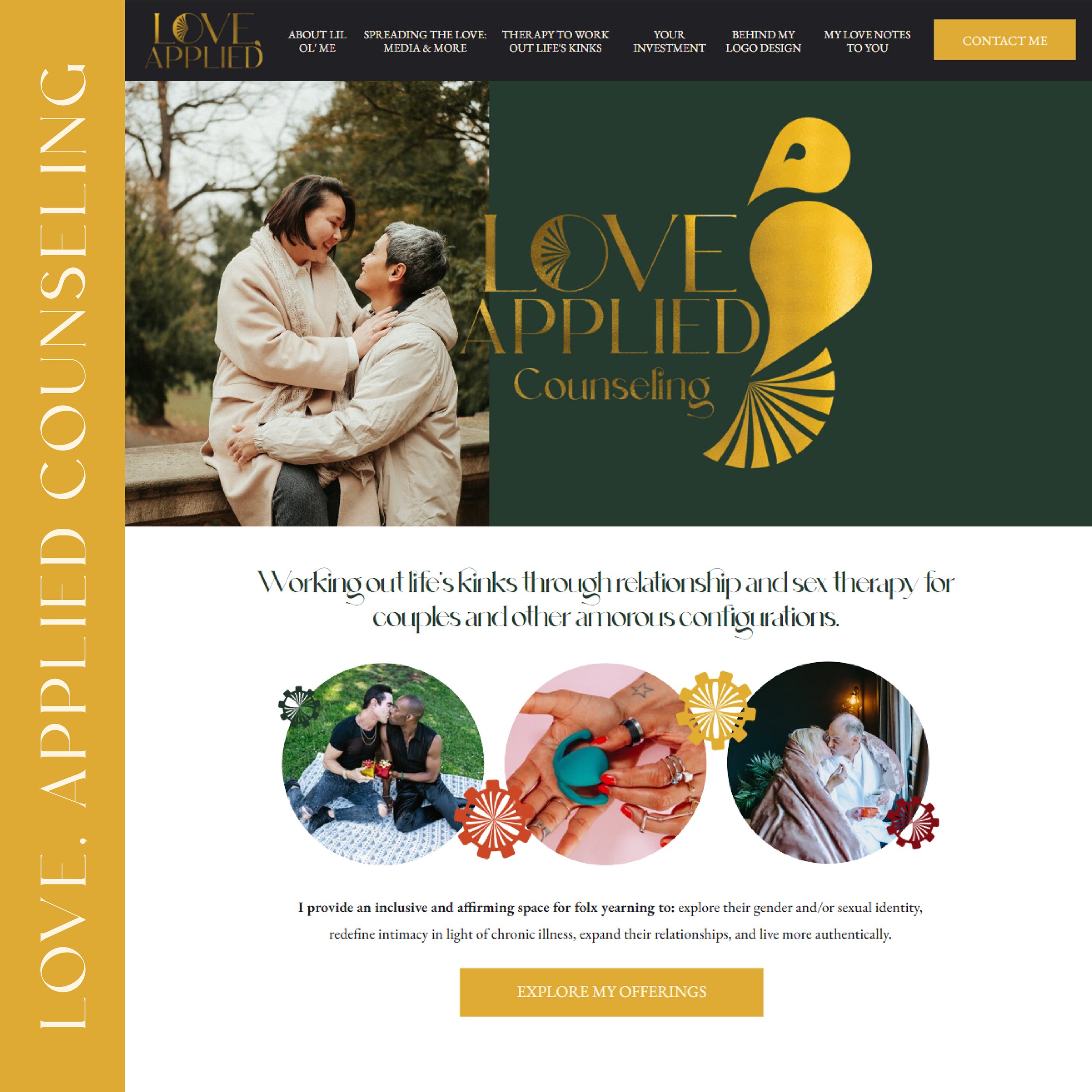
Multiple logo designs (at least four!), fun patterns, and illustrations that all work together to showcase your unique services and style
A set of complementary fonts you can use on all your documents, not just your website
A complete color palette to match your personal vibe, while being professional
Aligned stock photos sourced for you – and that actually reflect your real, human clients
A tagline and website copy I’ll write for you to help distill and communicate your essence
Tiny, hidden details in your brand and website design meant just for you
The confidence to use all these tools out in the wild!
Branding is so much more than a single logo. Like the work you do for your clients, there's so much more under the surface. Here’s what you get when you work with me:
THE PROCESS OF BRANDING AND WEBSITE DESIGN IS AN OPPORTUNITY FOR SELF-EXPLORATION THAT, OF COURSE, ENDS WITH BEAUTIFUL DESIGNS THAT SUPPORT YOU AND YOUR BUSINESS.
WANT TO LEARN MORE?
With The Brand Anthropologist, you'll leave our work together with an effective marketing tool that connects with you AND your clients - whether that's a brand package you're excited to use on your social media platforms or a website that does that work for you.
We’ll be a team, collaborating to create something real and resonant for you and your audience. I consider each project a genuine honor – knowing you trust me with something so personal – and I treat your designs as if they were my own, putting thought and care into the placement of every pixel.
My clients regularly cry happy tears when I present their brand and website designs because they feel seen, not only as business owners, but as human beings.
Yes, that last part about happy tears is 100% true! But don't take just my word for it. Here’s what some of my clients have to say about their experience:
I'm a designer for therapists because I’m a therapy client. I know firsthand the value of your work because I've experienced it. And that's true for ALL of my clients!
I love tattoos and art in all its forms and have a deep respect for your beautiful, creative work.
I've experienced the benefits of coaching and how it helped me grow my own business.
And I accidentally became a gym rat in the process of recovering from an injury (oops!), so I know the value of holistic, trauma-informed massage therapy, chiropractic care, strength training, and more.


Do you offer a human-centered service or product like therapy, coaching, chiropractic care, massage, personal training, yoga, or art of any kind?
If so, I'd love to work with you!
For better or for worse, I'm someone who prefers to be transparent, vulnerable, and overly earnest, so you can expect me to be honest about my excitement in our work together. Every new project is guaranteed to be my favorite one yet.
Are you ready to be my new favorite client?